Examples of implied space

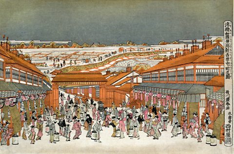
In this Japanese woodblock print, space is implied through all these techniques.
Size - People in the foreground are much larger than those in the background. The figures along the path gradually get smaller as it stretches into the distance.
Colour – The strong orange of the buildings stands out and seems closer than the white of the fields behind. Small areas of orange, pink, beige and grey are used in close proximity to each other in the foreground street. These colours are used in smaller amounts in the background.
Overlapping - Buildings and people are overlapped so that they appear to be in front of or behind each other. This creates a sense of depth.
Placement – The foreground is positioned lower down in the frame.
Perspective – The buildings are drawn with lines that lead to a vanishing point. They appear to get smaller as they head into the distance. A number of different vanishing points are used in the fields in the background. The space seems flatter and less realistic.
Atmospheric perspective – People and buildings in the foreground are richly detailed. We can see the patterns of different clothing and individual tiles of the roofs. Figures in the background are suggested by much simpler outlines and blocks of colour. Fields and trees in the distance are suggested by much simpler use of lines.
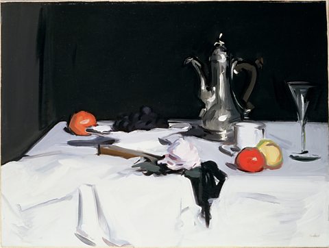
These techniques are used in many types of art, not just landscapes. Still Life with Coffee Pot (Samuel John Peploe, c.1905) uses the same techniques to create a realistic sense of space and depth for a much smaller subject:

Size - The tangerine in the foreground is slightly larger than the background fruit.
Colour – The tangerine in the foreground is a much more intense orange than the fruit in the background.
Overlapping - The tangerine overlaps the peach which overlaps the coffee cup which in turn overlaps the coffee pot.
Placement – The tangerine at the back of the table, the grapes and the coffee pot are all placed higher in the frame than the objects in the foreground.
Perspective – One point perspective is created by the line at the edge of the table.
Atmospheric perspective – The objects are all relatively close together, so there is less atmospheric perspective. The grapes in the background are shown with slightly less detail than the foreground fruit.