Proportion
Description
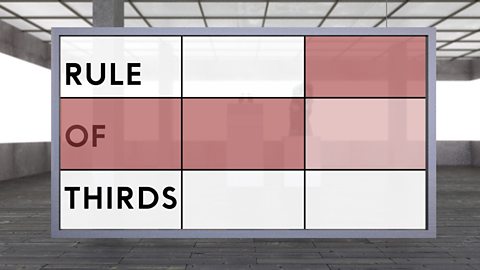
Proportion and scale can be used to provide realism or can be exaggerated to provide distinctive artwork. Leonardo Da VinciÔÇÖs ÔÇśVitruvian manÔÇÖ is an artwork showing human proportions. Auguste RodinÔÇÖs ÔÇśThe thinkerÔÇÖ sculpture was created in a realistic proportion. Artworks with different proportions or that have scaled up elements can look unusual. Alberto GiacomettiÔÇÖs ÔÇśThree men walkingÔÇÖ has figures that are out of proportion ÔÇô with the figures creating a sense of isolation. Claes Oldenburg, Coosje Van Bruggen and Frank O. Gehry designed a building to look like an enlarged pair of binoculars. Making this the fa├žade of a building means the design stands out more than the traditional architecture surrounding it. Proportion can be seen with the rule of thirds - when works are divided three times vertically and three times horizontally. Edward HopperÔÇÖs ÔÇśNighthawksÔÇÖ shows this concept. The main subjects are focused in the right hand third where they grab the attention of the viewer. Keywords: Scale, Proportion
Classroom Ideas
Can be used to recap on proportion or could lead into a classroom discussion on principles of design.
Principles of design
Now playing video 2 of 7
- 1 of 7
2:33
- Now playing2:35

- Up next2:26

- 4 of 7
2:43
- 5 of 7
2:38
- 6 of 7
2:28
- 7 of 7
3:29