News on the internet is largely served up as 500 to 800-word articles - a legacy of newspapers. Although the digital article has been enhanced and improved with new technologies, it still works on the assumption that 'one size fits all'. 91�ȱ� R&D is developing new story formats for news that are more effective than conventional video or article formats. I have written elsewhere about . We think there might be better things.
Maybe we'll invent an industry disrupter. Maybe not. But we can learn about the evolving needs of our audiences, experiment with formats, inform the design of future systems and interfaces, and inspire people. In that spirit, we wanted to share our learnings from the first two-month phase of 91�ȱ� R&D's "Reinventing News Stories" project - our ideas and prototypes and how we got there.
The target audience
Generation Z (18–26) in the UK
For this first phase of the project we chose to design new story formats for young people — they are digital- and mobile-first and tend to be open to new experiences. They are also a really important but hard-to-reach audience for the 91�ȱ� so this seemed a good place to start.
How we worked
I set up a multi-disciplinary project team with the key skills to make news prototypes; a multimedia journalist from the World Service, a UX designer, a user researcher and a developer. A “minimum viable 91�ȱ�” if you like.
Because of the large possibility space of ideas, we wanted to test lots of concepts as quickly as possible, kill the weak ones early, and iterate or create new ones. To do this we needed regular, early user feedback. We aimed to design for the needs, behaviours and context that we heard about from the users we interviewed.
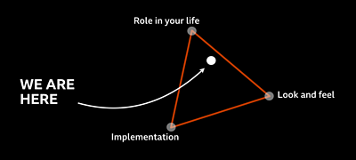
To enable us to make and test many things we aimed to make . We had enough background knowledge of enterprise back-ends and content management systems and data sources so our ideas weren’t completely unrealistic, but this didn’t constrain us.
However, constraints are a great inspiration for creativity, so as well as focusing on a young audience we also limited our scope to only re-using content the 91�ȱ� already produces. 91�ȱ� News is pretty unique in the scale and breadth of its information ecosystem. Across TV, radio and digital, we reach hundreds of millions of people across the world every week and publish thousands of stories in many forms. I felt this “constrained freedom” was important to be able to creatively explore the space of new story formats.
We developed ideas into testable prototypes on a weekly basis, using real news stories, and over eight weeks we showed 12 prototypes to 26 people from our target audience.
Could we combine existing media to make online news more accessible, engaging and relevant to young people?
How we evaluated ideas
What is a good idea anyway? For this project it’s important that people can understand and use the format intuitively. It’s important that it fits their needs, contexts and technology. And for the 91�ȱ�, it has to work at scale and enable journalists to tell stories in an efficient and creative way. Overall we’re looking for formats that are feasible, desirable, meet user needs and are new and innovative.
So as well as our regular user testing, we evaluated the prototypes ourselves against a range of criteria:
- Is it usable and understandable?
- Is it delightful and engaging?
- Is it distinctive and new?
- Does it meet audience needs and behaviours?
- Does it strike the right tone and style?
- Is it easy to build? (technically)
- Is it easy to create stories for it? (a key business need)
- Does it work across different genres of news? (e.g. features, breaking news, long-running stories, digests…)
- What kind of pattern or format is it? Is it a new kind of interaction or is it a new way of telling a story? Or (my definition of a format) is it some kind of a combination of these?
We used “catwig” cards to help us evaluate the prototypes. (Yes, ). Developed by Libby Miller and Richard Sewell, these cards are designed to help you think along various axes of evaluation. We used our criteria to make our own “newswigs” cards. Libby subsequently created these cards professionally and you can .
What we learnt about 18–26 year olds and news
- They want to skim, but dig deeper when they’re interested
- They want to understand complex stories
- They want to read a story all in one place
- They want help forming opinions
- They want a choice of media to suit context
We did a mix of desk research, including reports from the , , the and the 91�ȱ�, and interviews with 26 audience members from our target demographic. We wanted to find out how they consume news, and asked them to test our prototypes.
We found that young people are trying to navigate a difficult path between information overload and FOMO (fear of missing out). Most of our interviewees had news apps, including the 91�ȱ�’s, and some used system news apps (like or ). Skimming the headlines in the morning is often the first thing they do. They want to keep up-to-date with the news, but will only dig deeper on certain stories. Social media is important in finding news, although the platforms are increasingly perceived as a negative space and they prefer to share stories in private messaging apps instead. And, surprising to us, Snapchat and Instagram weren’t really used for news.
Most young people recognised they inhabited “filter bubbles” on Facebook, insulated from views different to their own, and there was a desire to escape this and get a wider view. However, they often had neither the time nor know-how to do this. They told us they wanted news to present a range of viewpoints to help them form their own opinions.
In general, they wanted choice on how to consume information. There was an apparent preference for text, but it always depended on their context and the story. Limited mobile data plans, for example, meant video was consumed more at home.
And anecdotally, the more playful we made our prototypes the more engaging our participants found them — even if we didn’t always get the interaction quite right.
Our Beyond 800 Words Series:
Prototyping New Story Formats for News
News Formats for Personalising and Understanding
What User Testing Taught Me About Writing News for Young People
Building many things

We made 12 prototypes — a mix of working web pages, mockups and videos. The ideas ranged from playing atmospheric audio for a story, scrubbable videos, swiping through viewpoints, choosing your format, curations of stories, cinematic introductions and expandable explanations. Everything was designed for mobile, because that’s what everyone we spoke to used for online news.
We evaluated as we went, and developed the most promising ones further into new variations. We also tested the best prototypes with several different news stories to ensure it wasn’t just the content the users were drawn to. What follows were our four best prototypes.
����貹�Ի��� �Ĕ�Ċe����������&�Բ�����;���DzԳٱ���
“I like that, if you’re unfamiliar with something it’ll clarify that” — M, 22
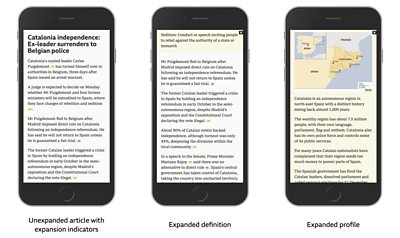
The 91�ȱ� is often criticised for assuming too much knowledge, which can be a barrier to understanding — things like business jargon, challenging vocabulary or background to complex geo-political stories.
This prototype, Expander, seeks to address this with additional information hidden within expandable boxes. It gives the user a clean and concise reading experience upfront but with the opportunity to ‘dig deeper’ for more information.
A yellow ellipsis icon indicates additional text: a profile of a key figure, a dictionary definition or background to an aspect of the story.
A blue “eye” icon indicates something visual — an image, video or social media embed. We call these “visual proofs” where, for example, we show the press conference the article references.
It’s simple but effective. This Generation Z audience seems to prefer information in one place — rather than links taking them elsewhere. We think this modular approach could work well for long-form journalism and for topics that need additional explanation like politics or economics.
Similar concepts can be seen in reusable factboxes on and other places. was also an inspiration.
Incremental — choose your own format
“Really like that, the long/short/skip”— F, 23
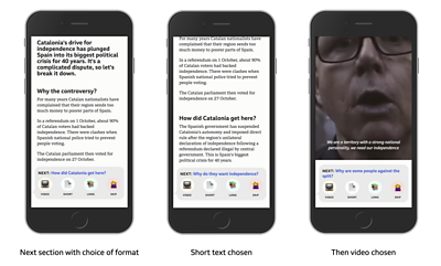
This prototype, Incremental, breaks a news story into sections and gives you the option to consume each chunk of information as either video, short text, long text or skip it.
It’s a straightforward interaction, presented in a conversational style. It proved popular with our test participants in helping to explain the big picture: they said sub-headings and nuggets of information were easier to absorb, having content in one place is good, and they liked the option to select the length and media type to suit their preference or situation.
Overall Incremental had the best user feedback from this round. We think it could be a kind of long-form by stealth — a way of engaging people put off by long articles or lots of sidebars and related article links.
We made it look a bit message-y to appeal to this audience and so it looks a bit like though we feel it’s quite different. Under the hood it is conceptually and the structured content could be re-used in or voice interfaces.
�վ���ɱ�Ǿ��Գٲ� �Ĕ�Ċs�ɾ��辱�Բ�&�Բ�����;�DZ辱�Ծ��DzԲ�
“That shows you both sides, in video form, and you can obviously decide for yourself and see what other people think as well”— M, 24
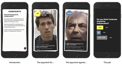
Young audiences want to understand complex stories — the why not just the what. They also want a range of viewpoints to help them understand an issue, reason it out and form their own opinion. This prototype was informed by these key needs and offers polarised opinions on a story.
Viewpoints is presented as a series of cards. The first gives a brief overview of the issue, in this case “Should Catalonia be independent?”. The user swipes to reveal a short video arguing the case for independence, and then swipes to see the argument against. The final swipe reveals a poll.
Participants had told us about “filter bubbles” on social media, and concerns that algorithms were giving them a skewed sense of the world. Getting both sides of an issue appealed to them. They also liked hearing from individuals with first-hand experience of the issue at hand.
While we don’t think this particular execution is quite right, the concept of Viewpoints was popular, and the playful interaction was more effective than the same content presented in linear form. The interaction pattern was inspired by and the mobile game !
Fastforward — scrollable video
- “You can go back to clarify, that’s good”— M, 21
Fastforward is a new feature for digital video with subtitles or captions. It seems pretty obvious but we think it is fairly novel. The caption text and the video are synchronised so you can scrub forwards and backwards in the video by scrolling the text, putting the user firmly in control. It enables you to skim video really easily.
There is also a handle on the text area which lets you expand the text field to fill the screen if you would rather read than watch, or vice-versa.
As an interaction pattern for video it tested really well. Participants talked about using it to skip to interesting bits, or to review something they missed. They found it intuitive to use once they’d discovered the function.
What’s next?
We’re working on piloting some of these. recently built this headlines pilot for Google Amp Stories, which was inspired by one of our prototypes.
Although we didn’t aim to make structured, atomised or object-based media concepts, it’s notable that two of the prototypes featured (Incremental and Expander) would naturally be based around .
For our next phase of the project have the same broad brief to develop new story formats, but with a new angle — personalisation — which should push us in new directions. In the future, machine-learning and AI will increasingly play a role in serving up ultra-personalised news products and recommendations of stories to users. But what if the story itself could adapt to you?
Read a review of the landscape of digital news formats: .
- Next in this series: News Formats for Personalising and Understanding
- -
- Our Beyond 800 Words Series:
- Prototyping New Story Formats for News
- News Formats for Personalising and Understanding
- What User Testing Taught Me About Writing News for Young People
- Reinventing the News Article
- 91�ȱ� R&D - Newsbeat Explains - Piecing Together the News for Young Audiences
- 91�ȱ� R&D - Mobile-First News for Young People - Our Findings from Newsbeat Explains
-
Internet Research and Future Services section
The Internet Research and Future Services section is an interdisciplinary team of researchers, technologists, designers, and data scientists who carry out original research to solve problems for the 91�ȱ�. Our work focuses on the intersection of audience needs and public service values, with digital media and machine learning. We develop research insights, prototypes and systems using experimental approaches and emerging technologies.
