What do you know?
What are some ways that data collected from fieldwork can be presented?
Data from fieldwork can be presented using a map, graph or table.
Key points
- Once data from fieldwork has been collected, it should be presented. Choosing the correct method of presenting the data is important.
- Data should be interpreted in order to draw conclusions.
- It is important to be critical of any investigation you do to see how it could be improved in the future.
Presenting data
Video: Presenting fieldwork and investigations
Presenting fieldwork and independent investigations
Presenting fieldwork and investigations
Collecting data is part of fieldwork. The challenge is knowing how to present it. To find the best way to display the data think about how it was collected.
Data that is counted or measured is called quantitative data. For example, the number of visitors to a seaside resort over a year and the reasons for their visit.
Data in the form of images or words is qualitative data. This could be photos of the resort taken today or in the past or questionnaires with people on the seafront.
When you know which type of data you have, you can work out how best to present it.
For quantitative data that shows change over time a line graph might be best. With data that can be grouped use a pictogram or a bar chart.
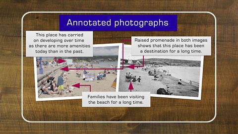
Qualitative data could be presented as annotated photographs and questionnaires could be turned into word clouds.
When data is presented clearly, it makes it easier to identify connections.
An independent investigation or piece of fieldwork produces a lot of raw data. There are numerous ways to present this data and each one has its advantages and disadvantages.
Choosing how to present data

There are simple methods of presenting data, such as creating tables or graphs such as bar charts or pie charts, and there are more sophisticated methods such as creating maps using Geographic Information Systems (GIS)Specialist software which links geographical data to create layers of digital maps to display information. .
It is important to make sure the correct presentation technique is chosen and that you can justify the choice.
For example, graphs are effective for showing data in a visual way whereas maps are useful for showing spatialSomething related to a space. data.
Another technique is to use field sketches or annotatedTo add notes, explanations or comments to a text, photo or image. photographs. For example:
- a photograph of a seaside location comparing tourism now and in the past
- a field sketch to show the different coastal defences in place at a seaside resort


Question
What is the best method of presenting spatial data?
The best method of presenting spatial data is to use a map.
Data presentation techniques
Here are some suggestions of data presentation techniques and reasons for choosing them:
Pie charts
Pie charts are basic graphics useful for comparing a similar category and for presenting a quantity that can be divided into parts. Pie charts usually show the amounts or percentages, making the results easy to read. This pie chart shows the reasons people gave for visiting a seaside resort.
A line graph
Line graphs are useful for showing continuous data such as changes over time. This graph shows the average monthly temperatures in the UK from September 2020 to August 2021.
A field sketch
Field sketches can help you to remember the places you have studied and visited. They are useful for highlighting the key features and characteristics of an area. Anyone can draw them and you don't need to be really artistic to create one. It is important to annotate them with lots of detail about the landscape. This field sketch shows the location of sea defences on a beach.
Graphs presented on a map
Graphs presented on a map allow you to compare data to location. For example, bar charts on a map such as this one can be useful to show how many people live in a particular location.
Word clouds
Word clouds are a great way to show the most common words or perceptionsThe way that people think about or understand something. People's individual perceptions of the same thing can be completely different. from questionnaires with the public. The words said most frequently are presented in a larger font, showing which are most important. This word cloud shows the survey results asking people the reason they were visiting a seaside resort.
Question
True or false? Field sketches need to be really artistic.
False. Anyone can draw a field sketch and you don't need to be really artistic.
Quiz: Presenting fieldwork
Interpreting data
Analysing data
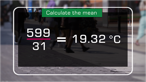
Once you have collected and presented the data, you can analyse it. Analysis is where patterns and trends are identified and described, links are made between different sets of data, and anomalyData which is significantly different than what is expected and that doesn't fit the overall pattern. are highlighted. When handling data, statistical techniques should be used to describe the data, such as calculating the averages using meanThe mean is the total of the numbers divided by how many numbers there are., modeA type of average - the most common value that appears in the data. and medianA type of average - the middle value in the sorted set of data..
At the analysis stage, explanations for the reasons for any patterns should be pointed out. If there are no patterns, suggestions should be made as to why this is the case.
Reaching conclusions
Once all the data has been analysed, a conclusion can be reached. All independent investigations start with a hypothesisAn idea that can be tested. or an enquiry questionA question asked to gain specific information. . These set out the aim of the investigation. The conclusion should refer back to these and state whether the hypothesis has been proved to be true or false or whether the answer to the enquiry question has been found.
At this stage, it is important to focus on the key aspects. Although the conclusion should not repeat all the data from the analysis section, the most important data can be used and any anomalyData which is significantly different than what is expected and that doesn't fit the overall pattern. should be pointed out in a more focused way than in the analysis section.
Evaluating fieldwork
The final step is to evaluateTo make a judgement about usefulness. the success of the investigation and to look at what worked well and what could be improved should the investigation be repeated.
The two main areas to focus on are:
- the methods of collecting the data
- the overall quality of the conclusions
Methods of collecting data
It is OK to be critical of the investigation and to look for the limitations which may have affected the overall results. Some things to think about are:
- Was the best location chosen?
- Was the correct equipment used?
- Should more sites have been visited or returned to at different times and would the results have been different?
Quality of conclusions
When evaluating the overall conclusions, you might consider:
- How the methods of collecting data impacted the conclusions.
- Whether enough data was collected or if a larger sample size would have been better.
- If the secondary dataData that has been collected by someone else through fieldwork. used was up to date. For example, if using statistics found online from a few years ago, these may have changed and could impact upon your conclusions.
Question
What is the final step in an investigation?
The final step in an investigation is to evaluate the investigation to see what worked well and what could be improved.
Quiz: Interpreting fieldwork and evaluating data
Play the Planet Planners game! gamePlay the Planet Planners game!
Make decisions for the planet in this KS3 geography game.

More on Geographical skills
Find out more by working through a topic
- count8 of 10

- count9 of 10

- count1 of 10
