What is a bar chart?
A bar chart is a simple and effective way to represent data.
The title shows you what you are interpreting. The vertical and horizontal lines are called axes.
- The horizontal line is called the x-axis.
- The vertical line going up is the y-axis.
Both are always labelled so you know what is being shown.
To interpret the data, you read the very top of the bar to see which number it reaches on the y-axis.

Example 1
Bar chart to show children's favourite pets
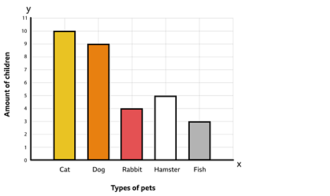
How many children chose a cat as their favourite pet?
The heights of the bar let you visually see which criteria was the most and least popular. Read the top of the bar for cats and see which number it reaches on the y-axis.
10 children chose cats.
How many more children chose a dog than a fish?
A dog was chosen by 9 children, while a fish was chosen by 3.
9 - 3 = 6
6 more children chose a dog than a fish.
Example 2
A bar chart to show children's favourite ice-cream
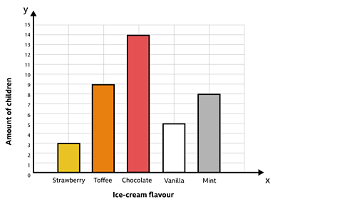
What was the least popular ice-cream flavour?
Look for the shortest bar. Strawberry was the least popular ice-cream flavour. Only 3 children chose it.
How many children chose strawberry, toffee and mint altogether?
ÔÇśAltogetherÔÇÖ means adding, so add up the number of children that chose those three flavours.
3 + 9 + 8 = 20
You can see that 20 children chose strawberry, toffee and mint altogether.
Activity
Quiz
Test your knowledge of bar charts with this quiz!
NEW! Play Guardians: Defenders of Mathematica - the winter update. gameNEW! Play Guardians: Defenders of Mathematica - the winter update
It's Mathematica as youÔÇÖve never seen it before, with all-new festive backgrounds and costumes. Available for a limited time only. Use your maths skills to save the day before it's too late!

More on Tables, graphs and charts
Find out more by working through a topic
- count8 of 8
- count1 of 8
- count2 of 8
- count3 of 8
