The unusual
When an element is unusual, unlike the other elements used or doesn't seem to 'fit' with its surroundings, we tend to look at it for longer as we try and work out why it is there.
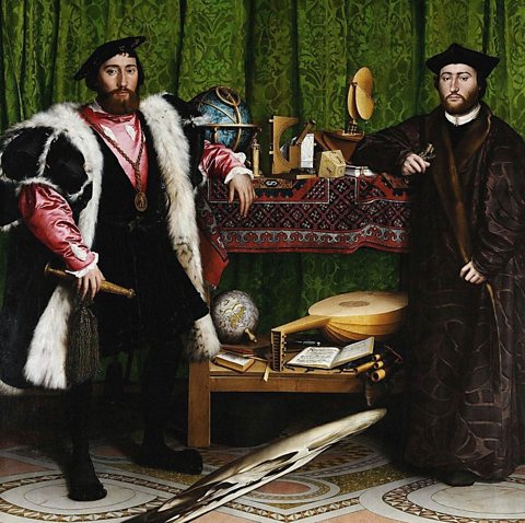
At first The Ambassadors (Hans Holbein the Younger, 1533) looks like a conventional double portrait with a number of objects arranged between the figures.
At the bottom of the painting is an anamorphicDistorted or stretched in a way that means that a normal image can only be seen from a particular viewpoint. stretched image of a skull.
The unusual technique used to show the skull and the way it seems unconnected to the scene around it emphasises the importance of this image of death and mortality.

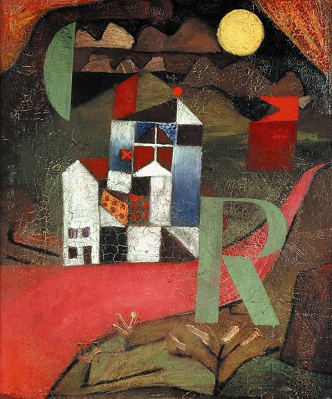
In Paul Klee’s Villa R, our eye is drawn to the familiar shape of the capital letter R.
It stands out as an unusual feature against the mix of geometricRelating to geometry and featuring straight lines and regular mathematical shapes and forms such as squares, circles, triangles, cubes and spheres. and organicIrregular, flowing or relating to nature. In art and design, organic shapes, forms or lines are imperfect as opposed to perfect geometric elements. shapes used to portray the house and surrounding landscape.

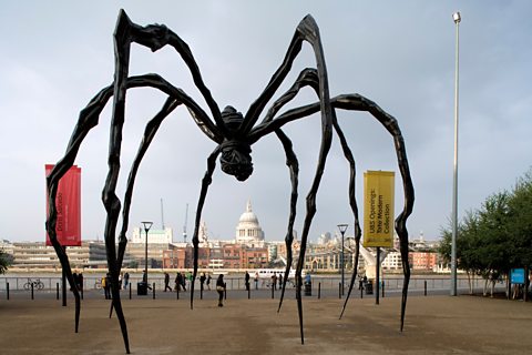
Unusual scale can also create emphasis. Maman by Louise Bourgeois (1999) uses its size to great effect. Viewers can walk underneath this enormous spider and feel small and insignificant in comparison.
The sculpture has turned a very small, largely unnoticed object into something giant. Bourgeois has made something terrifying that would get the viewer’s attention, even from a great distance.