Creating contrast and focus
By changing tones, artists and designers can create focal points in their work.
Our eyes are often drawn to the lightest object, so making a key part of a composition lighter than its surrounding can help bring it to a viewer's attention.

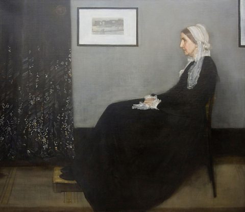
Dark and mid-tones are used most in Portrait of the Artist’s Mother (James Whistler, 1871). The black dress, dark curtain, grey wall and brown floor occupy the largest areas of the composition.
The woman's head, cap and hands and the picture on the wall are shown with white and bright tints. The viewer's eye is drawn to these small patches of light tone.
There is little contrast in Whistler's colour palette, so it is contrast of tones alone that creates these focal points.


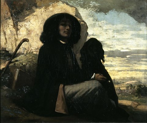
In a similar way, a dark element can be made to stand out if it is in contrast with much lighter surroundings.
The background of Self-portrait with Black Dog (Gustave Courbet, early 1840s) is painted with the brightest tones and largely in the most detail. The artist and dog are mostly shown using darker shades. The combination of subject matter, central positioning and contrast with the background draws the viewer's eye to these figures.
