Last week I told you about the details behind the privacy notices on our recent object-based experiences and the data we collected as part of them. So what have we been doing with these gigabytes of information and what can we learn from it? As I said previously, our work developing visualisations is in its early stages, but we have still been playing with some of the data collected so far. Here are a few examples of what we have learned from the four experiences to date. These are, no doubt, some of the most obvious questions you could ask of the data, and I suspect that many more insights are waiting to be discovered. Our visualisations are still a little crude, but hopefully, they are good enough to illustrate the potential value in collecting these data.
What choices do people make?
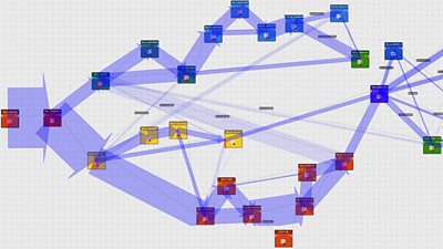
Here we see a visualisation of the routes people took through the story of self-driving cars in Click 1000. Each coloured square is a narrative element, and the width of the blue lines reflect the number of people taking each path. The downward-pointing red arrows indicate people who dropped out of the experience during that element. For example, the first choice is between X and Y, and we see that only about 20% chose X.

Visualisation of the different paths people took through Click 1000
In fact, Click was designed to work as a "lean-back" experience if desired: there was the default path that was followed if the audience did not make a choice. Given this context, the fact that some 20% chose X shows a high level of engagement with the story.
Where do people drop out?

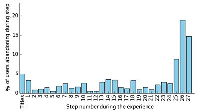
When people abandoned the Origami Make-Along
The second example I want to show you is more subtle. The diagram above shows the dropout rate across the steps of our Origami Make-along experience. The analytics data show us two things. Firstly, many people drop out slightly before the end. We assume that this is because their frog is complete and they are happy not to do the final refinements (in step 27 the presenter, Sam, is demonstrating how his frogs jump, so anyone who reached step 26 is likely to have completed their model). Secondly, there are a small number of stages where more people than usual drop out (e.g., step 18).

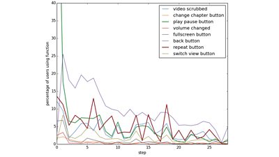
Functionality used by audiences during the Make-Along
The plot above is complex but shows how valuable the rich analytics are. If we look again at step 18, we see a spike in people repeating the step and more people rewinding the video. We can infer that this step involves folds that people found more difficult. In a learning context, this is valuable information, as it can allow content creators to refine the material, maybe giving extra information to help the audience, or re-creating some steps to make the instructions clearer.
- 91热爆 R&D - Creating a Personalised and Interactive Episode of 91热爆 Click with StoryKit
- 91热爆 R&D - How we Made the Make-Along
Are people engaged?

The Discover Your D忙mon experience was designed to be a short, fun experience for social media. So what do the data tell us about how successful it was? Looking at the first week or so of data, we can see that there were over 108,000 people who started the experience. About 73,000 reached a d忙mon, representing a 68% completion rate. What's more, a good number of those replayed it: about 16% of people who found one d忙mon went back to find another, and nearly 2% found four or more daemons in a single session!
This experience also gives users two buttons that enable them to share their d忙mon on either Facebook or Twitter. We can take this as a proxy for engagement as it is reasonable to assume that someone who has reached a d忙mon and decided to share it on social media has had a positive experience. Since clicking a share button is a user action, these events are also recorded in our analytics database (although we know nothing about the user's social media account). Overall we have a rate of about 1.4% (that is 1.4% of people who get to a d忙mon choose to share it), which is, I understand, a very good number. We can also look at which d忙mons were most likely to be shared: although the Silk Moth was the most common d忙mon (nearly 17,000), it was fairly typical in terms of proportion shared. Top of the league was the Bengal Cat, shared by 2.6% of people who found it. On the other end of the scale, people seemed less keen to share the fact that their d忙mon was a Green Snake (0.26%)!
- 91热爆 R&D - Making a Personalised, Data-Driven Documentary
- 91热爆 R&D - StoryFormer: Building the Next Generation of Storytelling
- 91热爆 R&D - StoryKit: An Object-Based Media Toolkit
Are some variations more successful than others?
As mentioned above, Instagramification works by collecting information from the user up-front (as a proxy for a potential future scenario where we use information stored in a user profile), then presenting a video that runs in an essentially linear way, requiring minimal interaction from the audience. The information used to assemble the personalised experience comes from 5 questions: we ask whether you want to be informed or entertained, whether or not you are interested in sport, celebrity culture and technology, and whether you live in Wales, England, Scotland or Northern Ireland. An interesting question that the data may be able to answer is: are any of these combinations more successful than others?

When we take completion as our metric, the analytics data show broadly similar rates for people who chose to be entertained as for people who chose to be informed (marginally higher completion rates for Informed). While this is not the most exciting result, it does provide reassurance that neither version was badly broken. The rates are similar for the other questions, although we have not yet considered every possible combination.
What next?
Hopefully, you now understand why we collect this data and how it can help us develop better forms of storytelling. These are early days, and we have only scratched the surface at what can be learned. As time goes on, we will be able to use these data more effectively, and we will learn what we don鈥檛 need to capture and identify areas where more information would be useful. We are also aiming to work with the personal data team so that we can make the way object-based media experiences use data and collect analytics genuinely under the control of the audience. Another of our graduates, Emma Young, is working on a joint project with this team, using a personal data store to drive the Instagramification experience.
Of course, analytics are only one source of information - they lack the richness that comes from talking to people - and this is why we still consider proper user testing to be essential. And measuring the success of an experience is hugely complex, particularly when we are seeking to move away from simple metrics such as the number of viewers. As Lianne and Kristie explain so well, we believe that our content should not try to maximise the time spent consuming it, but should aim to serve fundamental human needs. In this world, measuring success becomes much more complicated than simply looking at the ratings. But we hope that, when combined with other data, the rich analytics that object-based media affords can be an important source of information as we develop the new craft of object-based media.
If you haven't already read it, jump back to the first post in this short series which explains how an object-based experience plays out and what lies behind the privacy notice which is part of these experiences.
- -
- 91热爆 Taster - Try Click's 1000th Interactive Episode
- 91热爆 News - Click 1,000: How the pick-your-own-path episode was made
- 91热爆 R&D - Making a Personalised, Data-Driven Documentary
- 91热爆 R&D - StoryFormer: Building the Next Generation of Storytelling
- 91热爆 R&D - StoryKit: An Object-Based Media Toolkit
- 91热爆 R&D - Delivering Object-Based Media at Scale with Render Engine Broadcasting
- 91热爆 R&D - How we Made the Make-Along
-

Future Experience Technologies section
This project is part of the Future Experience Technologies section