Out Late: from directorâs cut to interactive adventure

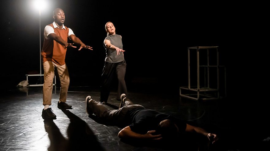
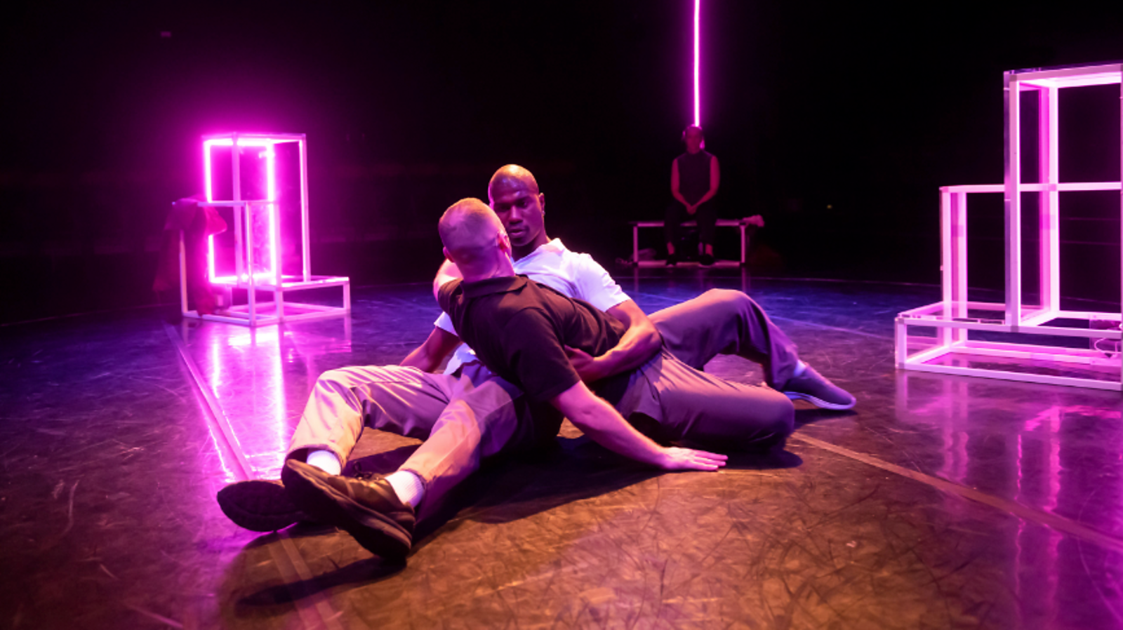
Out Late is a dance-theatre crime drama.
It began its life as a stage production, set in the round with the audience on all four sides, giving the work a sense of voyeurism that felt right for the genre.
Since starting work on Out Late in 2018, Writer Ankur Bahl, Dramaturg Pooja Ghai, and I have been manipulating the chronology. We were curious about how reordering scenes affects how the audience reads a narrative. This felt particularly important when exploring a crime drama, where the question of when an audience memberâor indeed a characterâlearns a piece of information is crucial to the experience.
Our focus on narrative, structure, and chronology throughout the development of Out Late felt like the perfect studies to bring to StoryFormer.
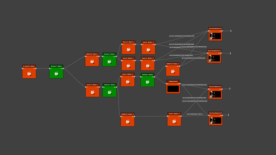
StoryFormer would allow us to further manipulate the chronology. We could take the 18 scenes of the work, put them in infinite combinations, test them out, and select new, interesting ways to experience the work. We could put the audience in control of which of those journeys they wanted to experience. In tech speak, a traditional audience became the âusersâ of this interactive experience. We created regular âcheck-insâ, questions asked at the end of each scene, or sequence of scenes. These questions get the user to respond to the story in the moment, in real time and the user's reaction informs how their experience unfolds. This segments the experience of the full narrative into bite-sized chunks and makes it bespoke for each user, giving them more flexibility than the âdirectorâs cutâ version I made for stage, or would have made in a traditional film. The result of this is that the user has 82 potential journeys through this StoryFormer experience, as opposed to the singular journey of the live performance.
The theatre show was in the round, so we knew we needed multiple angles and roving cameras to capture this voyeuristic, dynamic and ever-shifting work. Some of our characterâs scenes are set in an afterlife space. I made the decision for the text within these scenes to be delivered directly to camera, the only time this choice is made.
Very early on in reimagining Out Late for StoryFormer, Ankur, Pooja, and I realised we were going to have to group scenes in some way. It wasnât going to aid our story to open all possibilities up to a user from the get-go. So, we decided that we needed to group some scenes in the work in some way, whilst still allowing the user to choose which order they consumed the content of each section.
We ended up with four main sections. Placing this structural restriction on the experience meant we were able to make sense of any given journey through the work, but still leave some autonomy in the userâs hands about what in the content intrigued them and who/what they wanted to find out more about. To give an example, we decided that all interrogation scenes would need to be in the latter half of the experience. A user would come by the interrogation scenes in sections named âtop 2â and âbottom 2â. They would find themselves in âtop 2â if they wanted to follow Fifi and in the âbottom 2â if they wanted to follow Sebastian, who are our two prime suspects. The order in which a user consumes the interrogation scenes within these sections are up to them and based on their choices, and they may also, due to their choices, not see all interrogation scenes before seeing the final scene. This differed to the live version where the interrogation scenes were seen throughout the work, having the effect of jumping back and forth in time. In this digital interactive version, our timeline is in some ways more controlled and determined by the textual content and when each character learns specific bits of information. These kinds of considerations are very much about where crime drama meets an interactive experience.

Ankur and I made the decision that all questions/prompts given to the audience would not be in the voice of another character but rather a âneutralâ voice that simply asked the user to respond to what they had just seen, so as not to guide or sway a user. We also decided that the questions had to be related to the characterâs motivations, or to the userâs desire to head in a certain direction in relation to the plot.
Once we had crafted our structure for the digital interactive experience, it became clear a user could get to the end of the experience having not seen all scenes. The biggest challenge came when giving the user the choice to review all content they hadnât seen. StoryFormer remembers a userâs choices and tracks what content they have seen. As a result, it can, at any point, push certain content to a user if they have not seen it, but this relies on complex conditions being met. We decided to give our users a choice to review all missed content before our final scene. This was complex, especially when we considered the ramifications of this in relation to narrative. It meant bringing scenes together from different sections of the work and jumping around the story in a way that felt discombobulating. I made the decision that we would only see four of the potential six scenes that a user could have missed, making sure the experience as a whole, even if you reviewed certain scenes at the end, still felt cohesive and logical.
We are super proud of the results. It feels very different to the live version, or indeed the live stream that we have also produced. It gives the audience much more agency (which was what we hoped) and has them engage with the story in a much more active way than is possible in any other context. It essentially takes our work from being received by an audience, to being navigated by users, which is a thrilling development for how we share stories.

